


Unsung Illustrators of D&D
And what is TTRPG art for?

Pete Beard, a professional illustrator and former university illustration teacher based in the UK, has finished a 100-part series of videos titled Unsung Heroes of Illustration. Each video examines the life and works of three or four illustrators, mostly from the 19th through mid-20th centuries.
I’m less than half way through and I’ve learned a great deal from the series. Beard conveys how illustration reflects and influences a milieu, from book and magazine covers to war time propaganda, social satire, and advertising. Lesser known predecessors of modern fantasy illustration are also well represented (and he also has a video dedicated to the origins of modern fantasy illustration).
Illustrating TTRPGs
Illustrations accompanying tabletop roleplaying games (TTRPGs) tickle our imaginations and motivate us to play. They influence how we think about a game in overt and subtle ways. Watching Pete Beard’s videos has me thinking about these ways, as well as the less discussed game illustrators.
When Dungeons & Dragons art is brought up in online forums, I see the same names mentioned again and again. Most of these artists either did work for TSR in the 1970s or 1980s working on either Basic D&D or AD&D 1st edition. Erol Otus. Dave Trampier. Jim Holloway. Darlene. Jeff Easley. Larry Elmore. Or they contributed to 3rd edition in the 00s, like Wayne Reynolds and Todd Lockwood. But I started playing in the 1990s with AD&D 2nd Edition and while the works of many of the famous D&D artists who continued from the 1980s like Jeff Easley and Clyde Caldwell featured prominently, many others did as well. The work of Erol Otus or Dave Trampier was not on the shelves of my local Waldenbooks and I only came to appreciate their work much later. 1990s D&D feels like the Gen X of D&D.
The late 1980s-1990s era is known for its full color oil paintings on the covers of books and box sets, often in a style descending from the works of Frank Frazetta. But I found just as much inspiration in both the color and black & white interior art as in the covers. Here are a few of my favorites. I wish to recognize these less discussed artists and I hope their work inspires your game a little, as they have mine.
Carol Heyer
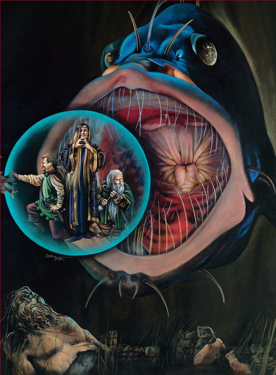
This piece conjures the fantastic! I don’t even remember noticing the broken statue on the sea floor before because I was so focused on what is unfolding above. The expressions on the party members’ faces are both amusing and perfectly reasonable. How is this painting not better known?
Carol Heyer painted many of the more imaginative full page color art in AD&D 2e rulebooks, including over 180 works for TSR as a freelancer. She is an active artist and writer and illustrates children’s books including three Hank Zipper books written by Henry Winkler. Perhaps the number of ideas she fits into a single work is indicative of her being a writer as well. You can find her website here.
David O. Miller

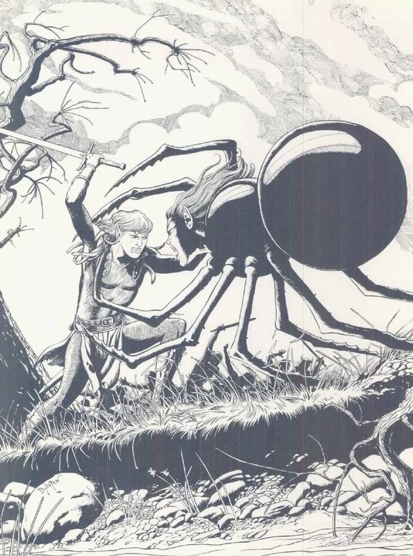
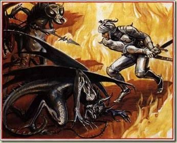
Like the original, Miller’s reinterpretation of a subject from AD&D 1e by Dave A. Trampier sets the wheels in my mind turning. Not only can I imagine myself standing right behind the mustachioed man amidst this scary encounter, I can also imagine going to sleep in the Green Griffon inn if that fire is put out in time to save it. My mind looks at this painting and begins to envision the bedrooms. I find myself imagining what just happened and what will happen next, and after that. And who is Emirikol? Was he powerful enough to force his way past the town guards at the gate? Does he disappear into the alleys of the town after his nighttime attacks, perhaps living there under another identity? Who are the two who are brave enough to confront him? What are they saying? How big is the town? Is the town guard, or the rest of them, on their way? I could probably run multiple sessions with only this painting as inspiration.
Miller didn’t conceive of Emirikol but his painting adds a new dimension to the story revealed in Trampier’s work.
David O. Miller is an active illustrator, art director, and teacher. You can find many of his illustrations on his website.
Valerie Valusek
I first encountered Valusek’s illustrations in The Complete Fighter’s Handbook. Many of them originally appeared in Greyhawk supplements.
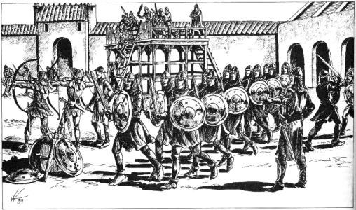
When I think about it I can’t think of any 2000s era D&D art depicting of a large force in downtime. It makes the imagined world feel more real when I see it. Like the people in this world, or at least in this town’s government, take defense and/or warfare seriously. No obvious player character stand-ins are in sight. Where are they? My wheels start to spin again. Are they a thief in the shadows behind those arches spying on the assembly, counting their numbers, or slinking over those tiled roofs like a cat attempting to sneak past these defenders to reach a gem in a room beyond that gate? Whose behind those windows in that gatehouse or is the normal garrison out here training, leaving an unoccupied upper floor. Maybe the whole party is hiding out there while they figure out their next move. Or are the player characters occupying the space of the viewer, having been invited on a tour of the the town’s defenses in preparation for an anticipated battle? Or because they are thinking of joining this force. Or perhaps the local lord is trying to impress upon them the consequences of defying local laws.
Because it leads me to wonder all of these things and more each time I look at it, this work by Valusek is actually one of my favorite pieces of D&D art and has been since the 1990s. The game prep practically writes itself and I feel its an artistic expression of Gygaxian naturalism, at least as I understand it. “The intention behind Gygaxian Naturalism is to paint a picture of a ‘real’ world, which is to say, a world that exists for reasons other than purely gaming ones.” (Grognardia)
The above works make me think of the difference between art for modules and art for rulebooks or setting supplements. I feel art for rulebooks and settings should be about how can play in that game or in that world. It shouldn’t be overly focused on player character stand-ins doing great deeds. Player character stand-ins are best if they are either generic or absent entirely. If absent, the art expresses that the world turns with or without adventurers. Outside of a character creation section, art could leave it to the players to imagine what their characters might get up to in the world, rather than showing them explicitly. On the other hand for an adventure (as opposed to a rulebook or setting book), I feel the priority of artwork is to portray environments, creatures, NPCs, and complex situations that might be difficult to describe with words alone. Player character-stand ins can be left out entirely unless they are helpful for depicting the effects of a monster’s attack or what happens when a trap is triggered. Of course, many of my favorite illustrations don’t follow these principles. I’m just trying to get at the rough contours of the interplay between art and gameplay.
Valusek Valusek contributed mostly black & white interior illustrations to over 100 books and magazines for TSR (I often run into her work while reading old issues of Dungeon) and her work also appears in the games Changeling: the Dreaming, TORG, and Paranoia. According to The Great Library of Greyhawk, Valusek has retired from illustration.
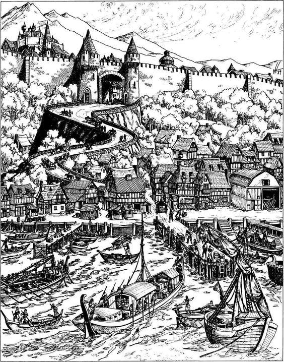
John and Laura Lakey
An audience listens rapt to the old warrior’s tale. What tale is he telling? I envision this evening unfolding either before the inciting incident of a campaign, or after it but before the adventure really gets underway. Residents gather around the fire, perhaps on a feast day, settling down after a long day and a big meal. They listen to the respected warrior tell of events fifty years past, when the land was threatened by a terrible danger. They feel safe in knowing that the danger was vanquished, during the exciting and fantastic events of that time. Soon, word reaches the town elders that danger has reappeared. Is it the peril of the past returned? Must new heroes defeat it once again? Or must they learn less obvious lessons from the old warrior’s tale? Perhaps the places or objects of power he spoke of hold the key to defeating this new menace?
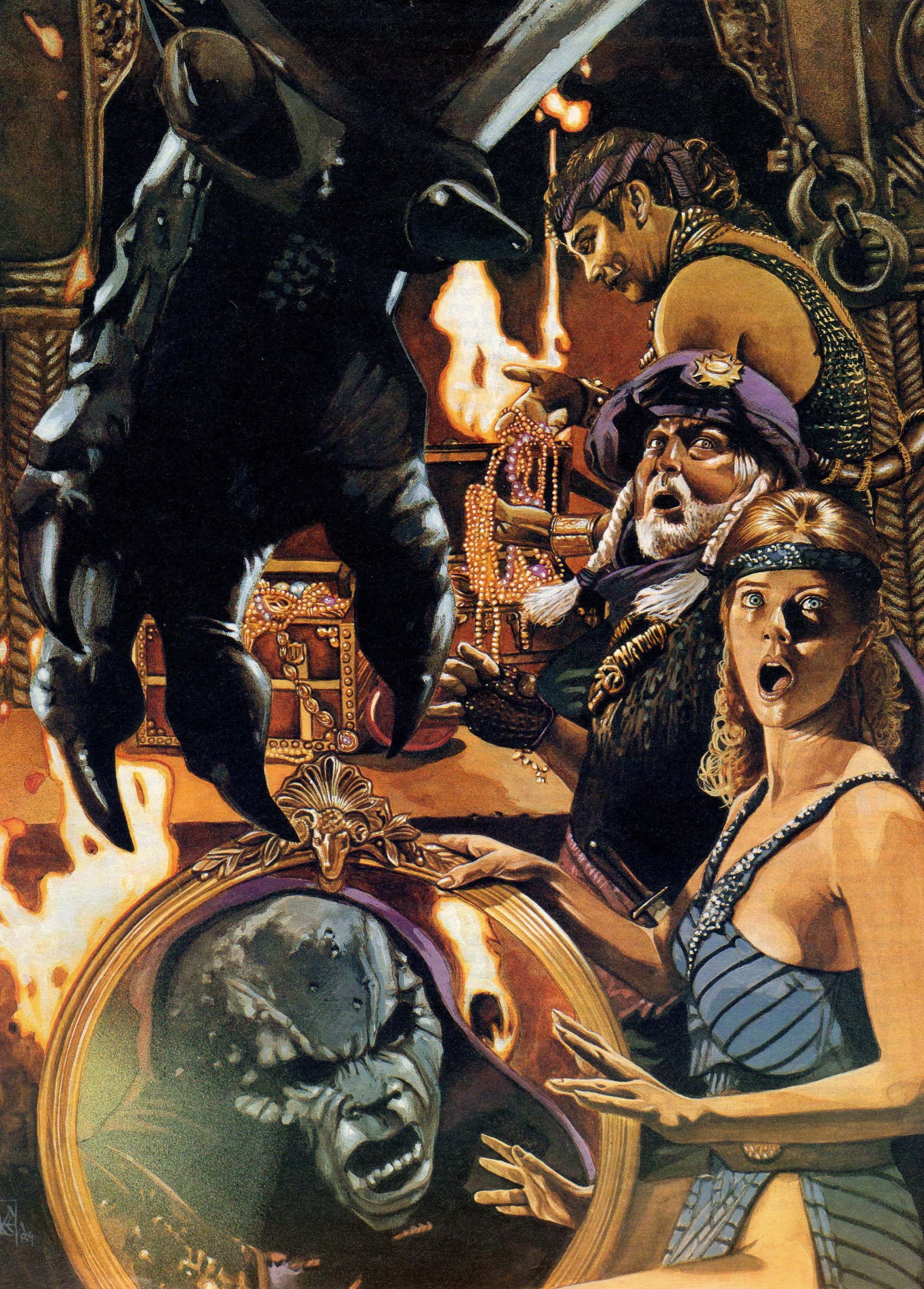
A lively dinner is interrupted. What were they in the midst of discussing? Who are these people? It seems like dinner was interesting enough before this monster teleported into the middle of it (that’s just how I’ve always imagined the monster arriving). The monster isn’t clearly identifiable because prior to 3rd edition, monsters didn’t have textbook trademark appearances and each illustrator portrayed them differently. The uncertainty about what confronts these dinner-goers adds to the excitement. What happens next? An abduction? A battle? A spell duel? Is the host on the side of the monster? Will the diners also end up fighting one another? Is this creature strong enough to rend these colorful characters limb for limb? Or is its power more esoteric and weird?
The funny thing is that I found myself asking these questions even before I took in this painting fully.
Because there is no dinner at all. My mind invented that because of the way the characters are sitting and the platter-like mirror. That is the degree to which this painting inspires my imagination. It takes it far beyond and even in contradiction of what is shown. Its two images for the price of one. Because when I see the treasure chest and realize that the creature is reflected in the mirror, entirely different questions emerge in my mind.
Did the creature just escape the mirror? Or was it scrying on the room through it as the adventurers approached. Does the creature have a magical alarm placed upon this treasure chamber, becoming alerted and able to see anyone who enters? Is the creature a brute or does the purple hood suggest it is a wizard of sorts? Was he a human or elf who became transformed into this fiend-like form in exchange for terrible arcane power?
The Lakeys contributed illustrations to the Mystara line (also called The Known World), often with a more humorous style, like for PC2 Creature Crucible: Top Ballista. They painted a number of full color covers for the Forgotten Realms and other AD&D 2e supplements. The Lakeys are available for commissions according to their website and have a back catalog available for purchase.
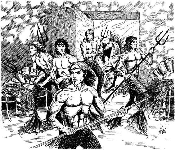
Arnie Swekel
In the mid-1990s, TSR produced a compilation of every magic item they had published in the history of D&D. The Encyclopedia Magica was printed as four digest-size volumes. While I’ve long been aware of them, I only read them in recent years since I couldn’t find them in any bookstores growing up. The set contains thousands of items and makes a useful resource for a referee looking for something unusual or an item to inspire for their own magical designs. Arnie Swekel did all of the black & white illustrations for the four volumes, which has to add up to well over 200 individual pieces. Swekel’s work is humorous and detailed. The following are all from Volume 4 but I could have chosen from any of the volumes.


Does it get better than this? Swekel is able to imply a story with every image.
You can find PDFs of the Encyclopedia Magica on DriveThruRPG. Swekel also contributed illustrations to the four-volume Wizard’s Spell Compendium from the same period, a collection of all wizard spells TSR had published up to the point. He has illustrated around 80 Magic cards and is the art director for Raven Software. I couldn’t find a website but he does have a LinkedIn. Here is an interview about his art here. He mentions being self-taught and he counts the Old (Renaissance) Masters and video game creatures among his influences.
Robert Lazzaretti (Lazz)
Tony DiTerlizzi and Planescape’s concept artist Dana Knutson are often credited with defining that setting’s look. Their ideas are some of the most original of any found in any RPG. But many of the most memorable images from the Planescape setting are Robert Lazzaretti’s maps.
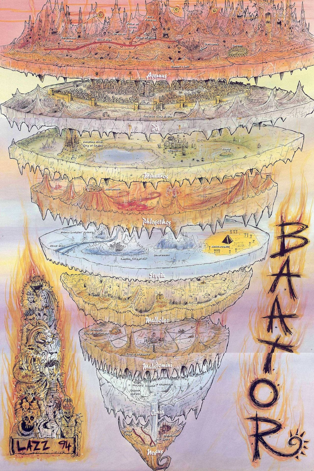
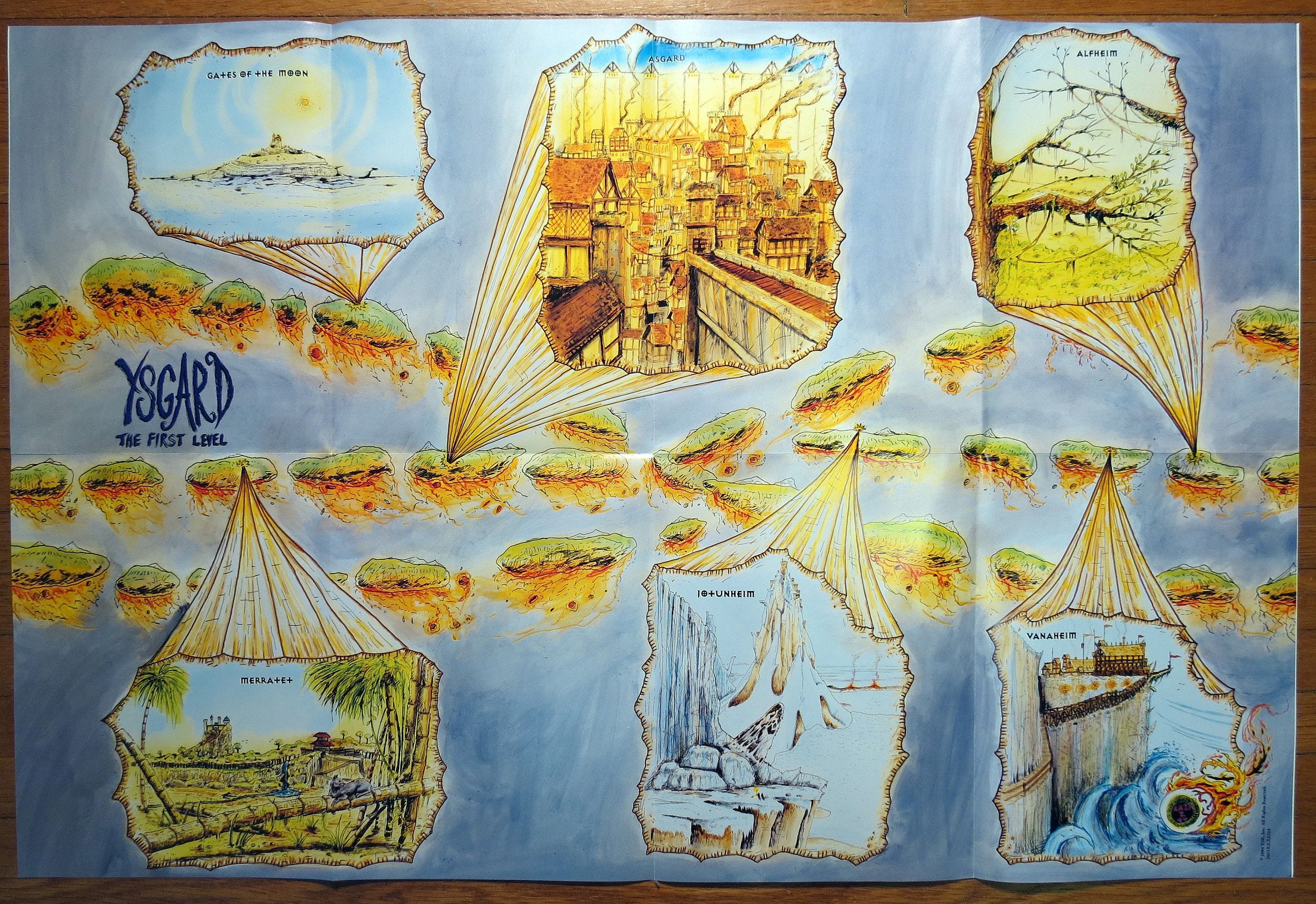
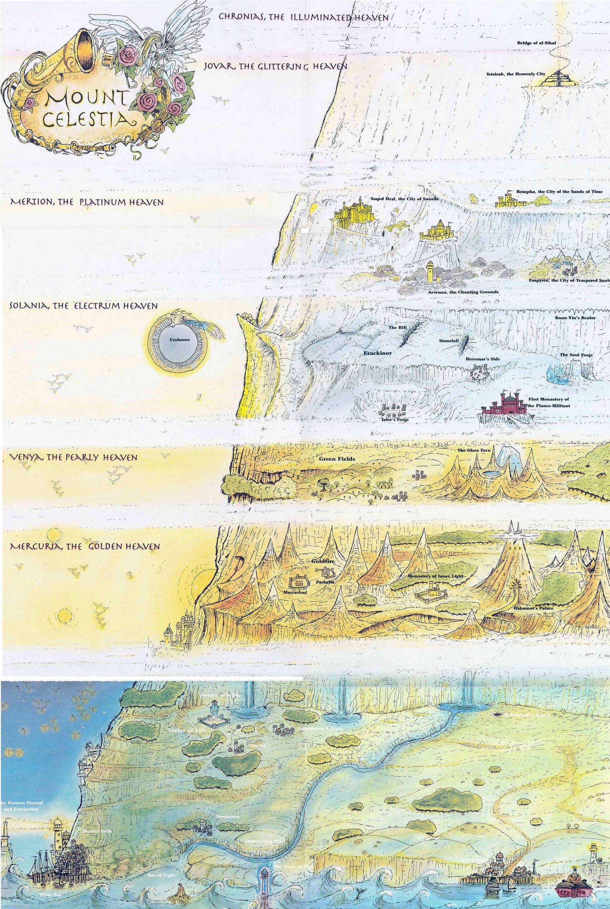
These are tremendously creative and intense works of art. In my opinion, Lazzaretti’s maps are the high point of artistic fantasy cartography. While these maps seem to be popular, I don’t believe the artist is as well known as DiTerlizzi (who may be better known today for his post-D&D career as the co-author of The Spiderwick Chronicles and other children’s books) and Robh Ruppel, who created many of the stark environmental illustrations for Planescape.
Terry Dykstra
Players had mixed opinions of The Complete Guide to Elves (1992), a supplement for AD&D 2nd edition, but it was a favorite of mine and one of the earlier D&D supplements I read. Terry Dykstra’s illustrations are elegant and evocative. They give visual form to a coherent society in a way that few depictions of elves do. While I fully appreciate the more alien elves of Lord Dunsany that are often encountered in the Old School Renaissance (OSR), a plausible romantic depiction of elves with their own myths, as portrayed in much of D&D, also has its appeal.
Dykstra contributed to many books and magazines for TSR from the 1980s-1990s. I could find little biographical information about him or his current whereabouts. If you have more information, please share!
In conclusion: what appeals to me most in TTRPG art?
I ask myself this at least once a year. My conclusions have shifted over time but not dramatically. Of course TTRPGs are full of amazing artwork but some pieces inspire my creativity when I’m prepping a session more than others. And I feel that that is an important function specific to RPG art as opposed to novel covers, film posters, or Magic cards.
Backing up, what is the role of art found in TTRPGs? At minimum:
Pleasure
Motivation to play
Depicting people, places, objects, and effects found in the game, whether real or imaginary, familiar or unusual
Evoking the mood and tone of the game
Advertising
But I’ve long felt some pieces, like many of those found above, go beyond that.
Scenes with greater verisimilitude and depth of field tend to be more generative for me. The scene is just as much about the scenery and the potential stored within it as it is about immediate action. The verisimilitude I’m after is elusive. Its not synonymous with so-called gritty realism or any other variety of Realism. I want to look at a scene and envision how I could sneak around in it or climb its buildings as if they were a large playground. Or imagine how I’d overcome an obstacle or who I’d talk to or pickpocket in a crowd. I don’t want the action being depicted to be the entirety of what is interesting in the picture. That removes most of the stored potential from a scene.
Within the OSR, there is a common maxim: “Prep situations, not plots.” What if TTRPG art had another maxim? “Situations, not heroics,” or something to that effect.
A scene can express the interactivity of a place, as Valerie Valusek does so well, or the stickiness of a situation, as the examples by Arnie Swekel do. A scene can achieve conceptual density. An illustrated scene’s contents are not the equivalent of flavor text on a Magic card, ultimately superficial to gameplay. They can get to the heart of gameplay as much as any map or referee’s description of what the characters sense or wizard’s spell.
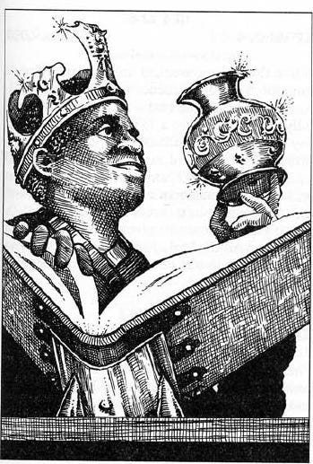
Art that invites the viewer to envision themselves as the focal character draws me in emotionally and may motivate me to play the game, but without engaging my creativity in as rich a way. Examples of this are the three excellent “paladin in Hell” illustrations from AD&D.
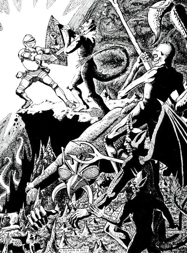
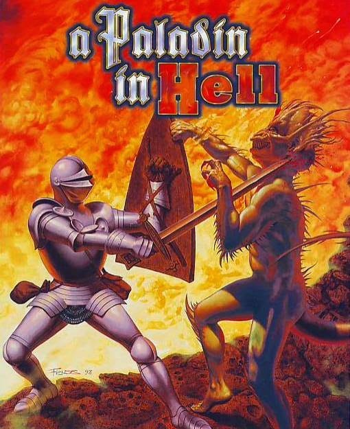
A stony ledge suspended above the fires of Hell is evocative, even if simple. These intense works motivate me to play but lack the complexity that leaves my wheels spinning coming up with situations that are interesting at the table. Its taken experience to realize that.
I am even less inspired by art focused on player character stand-ins to the point that the background or situation doesn’t draw the eye. PC stand-ins can take up so much space in a scene that little room is left for my mind to meander in. The art in the 5th edition core books and Starter Set tends to have minimally detailed backgrounds, like undeveloped concept art, leading me to wonder, “has the online popularity of concept art led to the concepts becoming the art?” Artists have long known how to lead the viewer’s eye around the image or how to make the eye stop on the first thing it sees. Much of the recent D&D artwork chooses to do the latter.
(A question for another post, but briefly, I wonder if video games and films have shifted the role of fantasy artists away from producing finished art to producing concept art which is then sent to special effects artists to render? And if so, have the processes involved in creating concept art been carried over to mediums where these processes produce the final form? I don’t mean this as a knock on any artists at all. I admire anyone who can produce striking artwork.)
To not seem too negative about trends in RPG art, later 5th edition art tends to be an improvement. My favorite art from the 5e era is in Icewind Dale: Rime of the Frostmaiden (2020). The bleak environment comes through more than any characters. Still this is more about ambience and mood rather than the proliferation of ideas. And one of 5th edition’s greatest strengths is that its art includes characters with more skin tones, hair styles, and body shapes than any previous edition. In no way is the goal of diverse representation in contradiction with the goal of prompting player and referee creativity. Correlation does not equal causation.
For the purpose of demonstration, here are some works of non-game art that prompt my creativity in the ways described above:
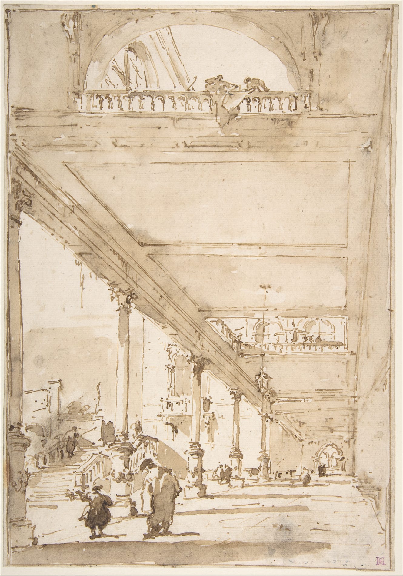
I share this last one to demonstrate that detailed brush work is not necessary to depict an environment with interactivity.
You could run a whole session or two set in this place with only this piece as a reference.
While the mood of these works may not match the mood of many RPG sessions, they are similar to Valusek’s architectural and landscape works in the way they spark my imagination. Stories start playing out in my mind as soon as I look at them and these scenarios become fleshed out as my wanders around. I immediately begin to wonder where thieves or fairies could hide. What magics might be present? Where might an ambush lie? Which trees and walls can be climbed? Where would someone set up a campground or plot their approach or escape? Where is treasure found? And most importantly, what shenanigans can players get up to? These images could even be used as playmats and I could ask players to describe where they are in the scene or where they wish to place their token.
Its no coincidence that I choose works that fall under the umbrella of Romanticism, which was fascinated with ruins, nature, and place, especially imaginary places (capriccios) or ones with emotional resonance. Many RPGs are drawn to these same themes, even at the level of mechanics. Appendix N fiction in general grew out of Romanticism.
Honorable mention: Jennell Jaquays (1956-2024)
While Jennell Jaquays is not unsung, in honor of her life and in response to her recent passing at the age of 67 I want to acknowledge her and her works, some of which are themselves not well known.
My favorite of her works came in the first D&D product I encountered: the First Quest box set, a mid-90s starter set that included a set of dice, a simplified AD&D 2e rulebook, four adventures (two dungeons, a Ravenloft-like haunted house, and a trip in a Spelljammer to an asteroid), poster maps for the adventures, cardstock pregen character sheets with full color character paintings, a cardstock town map along with cleric and mage spell cheat sheets, a full color poster of Jaquays’ painting below, and most importantly, an audio CD with tracks for each room of the adventures. The painting was originally the cover of Karameikos: Kingdom of Adventure (1994), a box set for the AD&D 2e Mystara line. She wrote on Facebook in 2015 that this was one of the first paintings she did for TSR and one of the largest, painted as a triptych with two other panels.
Her work for Spelljammer is stunning, including her Spelljammer-inspired covers for Dragon and Dungeon Magazines.
Jaquays worked as a game designer and illustrator. Her adventures The Caverns of Thracia (1979), Dark Tower (1980), and Griffin Mountain (1981) did more to support an open-world style of play than previous modules had. Many referees are still returning to them as models of game design. See more of Jaquays’ art here.
Interesting article. I randomly started a project to redraw 100 Dragon magazine covers. I love the variety of art in the early days of Dragon. I wish I hadn't restricted myself to covers because I really like a lot of the full page art they would use for the primary topic of the issue. Like the original Player's Handbook cover but with Bears/Ewoks. (I could just change my project but I'm trying to keep with the original plan.)
I was confused by your initial comments about the image with the mirror. I read your first question and went back to the image because I did not remember a dinner. Glad you explained that later. Awesome image.